
12th Jan 2026
Post-Holiday Pivot: Transitioning from Festive Sparkle to Moody Luxe Velvets

Many of you facing the post-holiday slump can update your space by replacing glittering accents with moody luxe velvets, letting rich texture and cozy warmth read as intentional rather than leftover cheer; you should mute overpowering metallics to avoid an overstated, garish effect and focus on layered jewel tones, tactile throws, and matte finishes so your interiors feel sophisticated and seasonally appropriate.

Understanding the Post-Holiday Mood
After the holiday excess, you probably crave restraint: January-March invites calmer palettes, tactile layers, and fewer sparkle-heavy surfaces. You’ll move toward materials that add depth—velvet, wool, matte leathers—and away from sequins and mirrored ornaments. Designers often pare back to one or two statement pieces to reset a room while leveraging textiles to change the mood without major renovation. Be aware that overusing dark hues can make small rooms feel cramped, but used selectively, velvet provides insulation, sound dampening, and instant luxe.
The Shift in Aesthetic
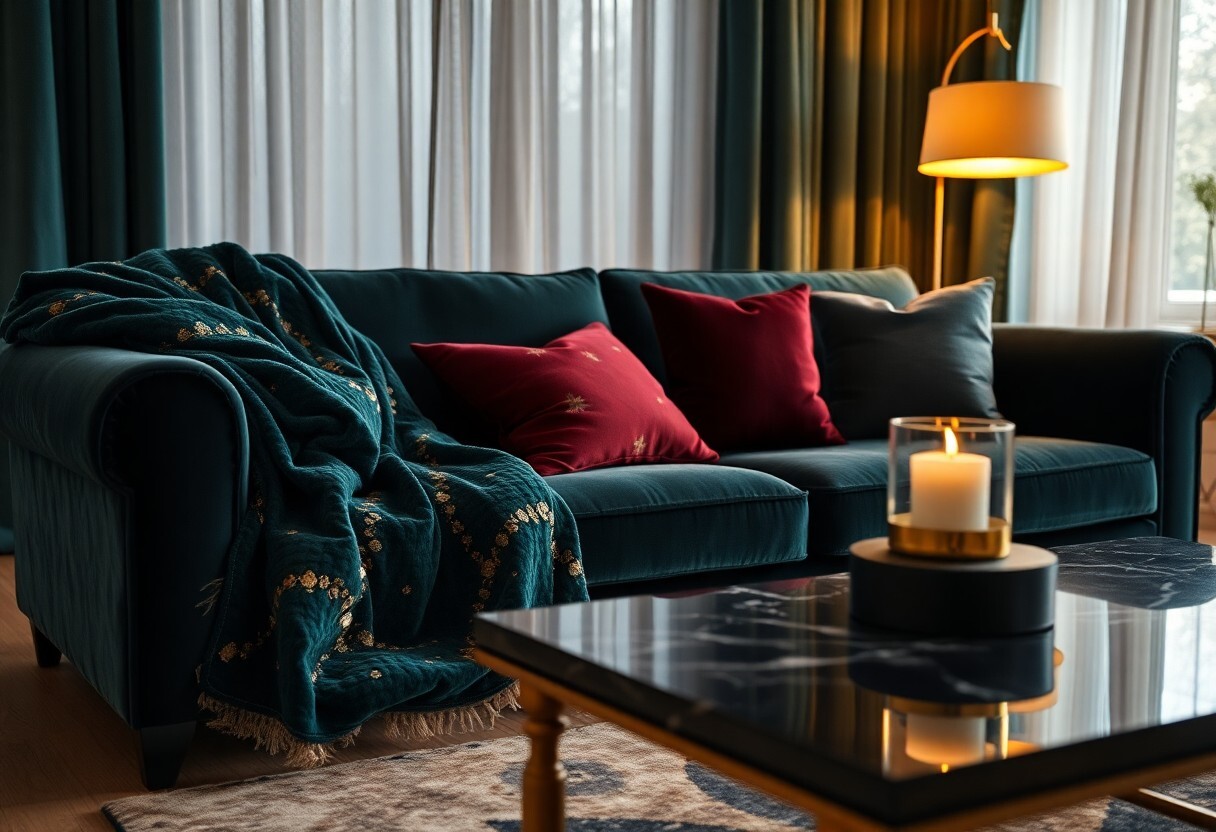
Rather than replacing everything, you should identify focal swaps: swap a glittery throw for a deep velvet cushion, or trade metallic accents for blackened brass or aged bronze. Limit your accent palette to 2-3 colors, and layer 2-3 textures—velvet, nubby wool, matte ceramic—to create richness without clutter. Practical moves include updating curtain panels to floor-length velvet and anchoring seating with a single jewel-toned sofa, which immediately signals direction while keeping flexibility.
Embracing Darker Tones
Start with safe, well-lit zones: choose charcoal, deep navy, forest green, or oxblood for larger pieces and reserve pure black for accents. Pair darker tones with warm metals and 2700–3000K warm LED lighting to preserve coziness, and use mirrors or glossy ceramics to bounce light. When you want drama, prioritize one dark surface—sofa or wall—and balance it with lighter rugs and throws; otherwise rooms risk feeling heavy.
Test before committing: place a 1x1 ft paint or fabric sample on multiple walls and check at midday and 8pm, because scale and light change perception. Opt for performance or cotton velvets if you have pets—velvet can show lint and wear, so vacuum gently and rotate cushions. For proportions, a deep-velvet sofa pairs well with a 9'x12' or 8'x10' rug to prevent the seating area from visually sinking; small adjustments like brass hardware and off-white throws keep the scheme grounded.
The Allure of Luxurious Velvets
Velvet’s appeal lies in its tactile contrast and the way it manipulates light: a rich pile and light-reflecting nap produce color shifts that read as depth, warmth and drama in seconds. You can lean into a single velvet piece—a sofa or drapery—to reframe a room’s mood, and when you choose pile heights between 0.5 and 6 mm, the visual effect ranges from soft sheen to plush matte, letting you calibrate intimacy versus formality.
Texture and Depth
When you run your hand across velvet the pile compresses and rebounds, creating zones of shadow and highlight; that interplay gives fabrics perceived volume without bulk. Designers quantify this by pile height and density—higher pile yields velveteen richness, while short, dense piles deliver crisper color and better abrasion resistance—so you pick velvet by tactile intent as much as by hue.
Versatility in Design
Velvet translates across scales: you can upholster a sectional, upholster dining chairs, frame a headboard, layer cushions, or hang heavy drapes to improve acoustics in dining or media rooms. Hospitality projects often specify velvet for both aesthetic and functional reasons, and when you pair velvet with metals or matte linens, it elevates contrast; selecting pieces with 30,000+ Martindale ratings ensures durability in frequent-use settings.
Beyond aesthetics, fabric construction matters: silk and viscose velvets read ultra-luxe but require delicate care, while polyester and performance velvets offer stain-resistant finishes and higher abrasion ratings (often 30,000-100,000 Martindale). You should weigh cleaning methods—many velvets are sensitive to water and need professional cleaning or a protective treatment—so choose the fiber and finish that match your lifestyle and traffic level.
Color Palettes for a Moody Luxe Look
Pair deep palettes with velvet to shift from festive brightness to moody luxe: aim for a 60/30/10 split—60% grounding shade, 30% secondary tone, and 10% accent. You can use hex examples like #0A174E (navy), #5C1029 (garnet), and #BFA6A0 (mushroom) to plan paint and textile swatches. Test fabrics in both daylight and lamplight so the velvet reads as intended.
Deep Jewel Tones
Tap into emerald, sapphire, and garnet—think #046A38, #0A3F78, and #6B1220—to get saturated depth on sofas and drapery. You should limit it to three primary jewel hues and vary the scale: one large field (sofa), one mid (rug), and one small (pillows). Pair with antique brass or blackened gold for a luxe pop; velvet intensifies pigments, so swatches matter.
Muted Neutrals
Use mushroom, warm greige, and charcoal—#BFA6A0, #91877F, and #333036—to balance intense jewels and keep the mood sophisticated. You can allocate 40-60% neutral coverage on walls and large furniture, then rely on texture—suede, matte plaster, or boucle—to prevent flatness while letting velvet accents sing.
Focus on undertones when selecting neutrals: olive or pink shifts perceived warmth noticeably, so sample swatches near your main light source for accuracy. You should layer matte paint, a mid-sheen trim, and at least two textured textiles—e.g., a boucle cushion plus a leather ottoman—to create depth, and add one saturated accent to avoid an overly muted room.
Incorporating Velvets into Your Decor
You can make velvet feel modern by limiting it to one to two statement pieces per room—think a sofa or headboard—and balancing it with matte textures like linen and wood; jewel tones such as emerald, sapphire, or oxblood read luxurious, while muted greys and taupes keep things restrained. Aim for velvet on roughly 20-30% of soft furnishings in a room to maintain drama without overwhelm.
Furniture and Upholstery
You should choose velvet upholstery with a performance rating that suits use: look for fabrics with >30,000 Martindale (or Wyzenbeek >15,000 double rubs) for family rooms, while delicate silks suit low-traffic bedrooms. Pair a deep velvet sofa with a wool throw and brass side table, and be aware that direct sunlight and pet claws accelerate fading and snagging, so position and fabric choice matter.
Accessories and Textiles
You’ll get a big impact from velvet pillows, curtains, and a bench—mix velvet cushions with linen or boucle in a 2:1 ratio to avoid heaviness; use lined velvet drapes to reduce light by 80-95% and add thermal benefits. Velvet table runners or lampshades can tie a scheme together without dominating, making texture the star in measured doses.
For upkeep and styling, vacuum velvet weekly with a soft brush, steam gently to lift pile, and spot-clean with a W/WS-safe solution; rotate velvet cushions every 6-8 weeks and schedule professional cleaning every 12-18 months for high-use pieces. When arranging, group pillows in odd numbers (3 or 5) and mix sizes—18x18, 20x20, and a 12x20 lumbar—to create depth while pairing velvets with contrasting textures like leather and raw wood for a balanced, moody-luxe look.
Creating Ambiance with Lighting
Choose warm LEDs (2700-3000K) so your velvet reads saturated; aim for 100-300 lux in lounges and 300-500 lux at reading nooks. You should use dimmable fixtures and bulbs around 800 lumens to recreate a soft post-holiday glow. Place one pendant per 3-4 m² for even coverage, and shift mood quickly with dimmer controls.
Soft vs. Bold Lighting Choices
Soft lighting—2700K to 3000K—wraps velvet in depth and hides seams, while bold options (3500-4000K, higher lumens) sharpen texture and reveal sheen. You’ll pick wall sconces, table lamps, or candles for softness; recessed trims or track heads for drama. If you upgrade to brighter sources, do not exceed the fixture's max wattage (often 60W) and favor LED equivalents to avoid heat and glare.
Layering Light for Effect
Layer ambient, task, and accent so your room reads intentional: keep ambient at 100-300 lux, set task areas to 300-500 lux, and make accent lighting about 2-3× brighter than surrounding ambient to draw focus. You should mix 2700K ambient with slightly cooler 3000-3500K task light for clarity, then use low-angle accent to sculpt velvet’s pile.
Use concrete combos: place an 800 lm table lamp (≈60W incandescent equivalent) beside seating for tasks, install 300-500 lm adjustable spotlights with a 24° beam 30-60 cm from art or fabric to create shadow and depth, and run ambient via 2700K ceiling LEDs. You’ll benefit from CRI 90+ bulbs so velvet hues stay true, and rely on dimmers and scenes to balance all layers without overpowering the space.
Conclusion
The shift from holiday glitter to moody luxe velvets lets you soften post-celebration energy while elevating comfort and depth in your home; you can anchor rooms with jewel-toned velvets, layer matte metals and textured neutrals, swap out sequins for plush throws and bolster pillows, and use dimmer lighting to sustain intimacy—these measured moves let your space feel intentional, sophisticated, and easy to live in until you decide to brighten it again.