
28th Jan 2026
Transformative Teal: The Color That’s Replacing Black

Many designers and brands now favor teal as a modern anchor, and you should note how its cool warmth can replace black's authority while softening harshness. As you adapt palettes and your visual identity, weigh the positive effect on perceived approachability and calm against the danger of reduced contrast harming legibility in low light or signage, so your choices balance style with practical visibility.
The Psychology of Color
When you focus on teal's spectral niche (about 490-520 nm), you tap both blue's trust and green's restorative signals; studies show color can boost brand recognition by up to 80%, so your hue choice directly affects perception. Designers use teal to lower cognitive load in dashboards, convey modernity in product shots, and balance emotional warmth with professional clarity in user interfaces and environments.
Emotional Responses to Teal
You typically register teal as simultaneously calming and alerting—blue calms the autonomic response while green promotes balance—so around 60% of informal surveys link teal to trust or tranquility. Healthcare waiting rooms and boutique spas employ blue-green palettes to reduce reported anxiety and make you feel steadier during high-stress moments.
Teal in Branding and Marketing
You see teal most in healthcare, fintech, and wellness brands because it signals competence and approachability; when used as a primary or accent color, it raises perceived innovation and accessibility. Tiffany's success with a signature blue-turquoise illustrates how a distinctive hue can become a brand asset, and your strategic teal can do the same if applied consistently across touchpoints.
For practical use, pick shades like #008080, #00796B, or #20B2AA, pair with charcoal (#212121) or coral (#FF6B6B), and ensure a contrast ratio of at least 4.5:1 for body text to meet accessibility. Avoid overuse—too much teal can make interfaces feel sterile—so you should reserve it for accents, CTAs, or key trust signals to retain warmth and legibility.
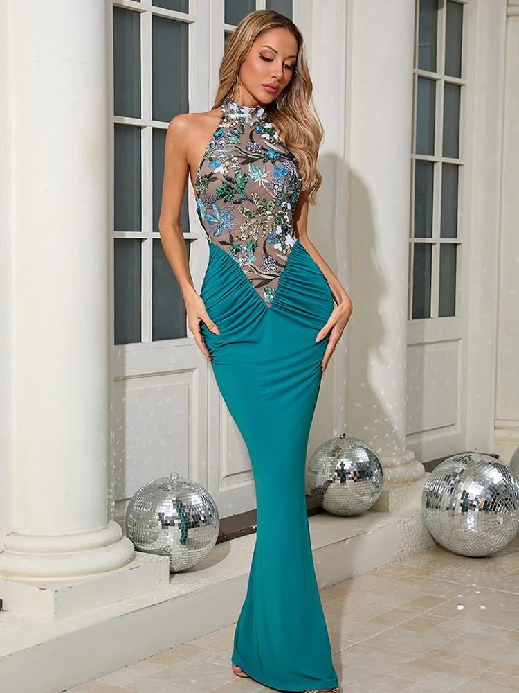
Teal in Fashion
Transition from Black to Teal
As runways and street style have shifted since 2022, you’ll notice teal replacing black as the go-to grounding shade: designers and influencers increasingly favor teal blazers, coats and eveningwear because the hue reads modern yet sober. Teal’s position on the color wheel (roughly 180°-200°, hex around #008080) makes it a neutral alternative that keeps silhouettes formal without the austerity of black.
Teal as a Versatile Wardrobe Choice
You can use teal across seasons and pieces—a teal trench, silk slip dress, or knit sweater instantly updates basics. Pair it with navy, camel, white or mustard for high-contrast looks; for work, a teal blazer over a white shirt reads professional, while teal eveningwear pairs well with gold jewelry. Note that neon teals can clash with warm undertones, so choose depth accordingly.
To introduce teal without overcommitting, start with accessories—a scarf, bag or belt—and then add one statement piece like a blazer or coat. Aim for 1-2 teal items per outfit or keep teal at about 20-30% of your look for balance. Care-wise, wash at 30°C with color-safe detergent and line-dry to preserve dye and vibrancy.
Teal in Interior Design
Creating Ambience with Teal
When you introduce teal, aim for 20-30% coverage—an accent wall, sofa and two pillows often hit the right balance. Deep tones (hex #00474F) ground living rooms while muted teals (#70A9A1) make small spaces feel larger. Pair with warm bulbs (2700K-3000K) to bring out richness, and use crisp whites on trims to preserve contrast; teal can feel dark in small rooms, so always test samples in situ.
Complementary Color Palettes
Start with triads: teal paired with brass, walnut and soft peach creates a modern-classic scheme, while teal plus charcoal gray (hex #333333) and off-white suit minimalist spaces. Coastal edits work with sandy beige and coral accents. You should favor textured materials—velvet and woven linen—to add depth; brass hardware increases perceived luxury, while matte black provides sharp, contemporary contrast.
Balance proportions: if teal is dominant, use neutrals for 40-50% of surfaces and keep accents at 10-20%; if green is an accent, limit it to under 30%. Accessibility matters, so ensure the decorative text meets a 4.5:1 contrast ratio against its background or switch to a larger type. In kitchens, pairing teal cabinets with marble countertops and brass pulls yields a durable, photogenic result often used in boutique renovations. ![]()
Cultural Significance of Teal
You encounter teal in branding, interiors, and public art; the color name was first recorded in English in 1917 and a standard web value is #008080. Designers use it to balance blue’s calm with green’s vitality, so you’ll see it in hospital wards and wellness brands as a soothing, restorative choice. Be aware that low-contrast teal on pale backgrounds creates a visual accessibility risk if your contrast ratios aren’t tested.
Global Perspectives on Teal
In Iran and Central Asia, you can spot blue-green tiles across Safavid mosques. Isfahan’s Shah Mosque (17th century) uses turquoise-teal mosaics to convey the heavens. Mesoamerican cultures prized turquoise in masks and mosaics, where you can still see Aztec turquoise in museum collections. Contemporary designers in Japan and Scandinavia repurpose teal as a minimalist accent, so your global view shows both sacred tradition and modern restraint.
Symbolism in Art and Literature
You’ll find teal and its neighbors used by painters and writers to signal liminality: Monet’s Water Lilies (c. 1896-1926) blends blue‑green fields to suggest depth and reflection, while authors use sea‑green imagery to cue shifting consciousness. Critics note that teal often represents emotional hybridity—neither cold nor warm—making it a frequent choice when you want an atmosphere that’s ambiguous yet evocative.
Contemporary examples sharpen that point: David Hockney’s 1972 Portrait of an Artist (Pool with Two Figures) uses a vivid turquoise‑teal pool to juxtapose intimacy and distance, and 19th‑century portraiture sometimes employed greeny‑blue tints to imply pallor or illness. When you apply teal in narrative or composition, it functions as a marker of depth, ambiguity, and cultural resonance that can carry both positive healing connotations and subtle unsettling undertones depending on context.
Practical Tips for Incorporating Teal
Use the 60/30/10 rule to introduce teal—allocate about 30% to your main accent and keep neutrals dominant; practical examples include a teal sofa, blazer, or an accent wall paired with navy or camel. Limit saturated teal to one focal element in high-traffic areas to avoid visual fatigue, and balance with warm woods or brass finishes to temper cool tones. Assume that you can rebalance any room by adjusting textiles and metallic accents.
- Teal accent wall
- Teal sofa or chair
- Teal accessories (pillows, throws)
Fashion Tips for Integrating Teal
Pair a teal blazer with navy trousers or a camel coat, and mix textures like velvet and silk to soften saturation; aim for a 60/30/10 outfit ratio—60% base, 30% teal, and 10% metallic or print—and limit yourself to 1-2 statement accessories. Opt for tan or metallic shoes to ground the look and avoid overpowering your silhouette. Understanding how proportion and texture influence perception can help you confidently wear teal.
- Teal blazer + navy trousers
- Teal dress + metallic accessories
- Teal accents (belt, bag)
Home Decor Ideas Featuring Teal
Introduce teal through one anchor piece—a velvet sofa, an accent wall, or 3-5 pillows—and pair it with off-white walls, walnut floors, and brass fixtures to maintain balance; designers often keep teal coverage to 20-30% of a room’s visible surfaces. Choose matte or eggshell paint sheens to reduce glare in sunlight and use patterned textiles to diffuse intensity.
- Teal velvet sofa
- Teal accent wall
- Teal textiles (rugs, pillows)
For installation, paint a single 10x12 wall in a medium teal (example hex #007f7f), anchor the space with a velvet sofa, and add 2 patterned rugs and 3 metallic accents following the 30% accent guideline; pick satin trim and warm wood tones to avoid a cold feel. You should test samples under morning and evening light before committing to full coverage.
The Future of Teal
Predictions for Color Trends
Expect teal to move from accent to primary across wellness, fintech, and lifestyle brands as designers push blue-greens in seasonal palettes; analytics platforms show double-digit search growth for teal-related looks since 2020 and Pantone trend guides note increased blue-green usage. You’ll see teal paired with warm neutrals, brass, and neon for contrast, incorporated in gradients and matte finishes on packaging and UI. Test swaps carefully: low-contrast teal on small text will create accessibility and legibility issues, so A/B test engagement when replacing black with teal.
The Lasting Impact of Teal
Teal will reframe your brand from stark to approachable sophistication, helping logos, packaging, and interfaces feel modern while signaling environmental and wellness associations that resonate with younger audiences; operationally, you must specify spot/Pantone references to keep consistency and enforce contrast standards—poor contrast is a major accessibility risk—so roll changes out incrementally to measure perception and conversion.
You should standardize teal across channels by defining hex/RGB, CMYK builds, and a Pantone spot match to avoid color shifts between screen and print. For accessibility, target a minimum contrast ratio of 4.5:1 for body text (WCAG 2.1); for large headings, 3:1 may suffice. In photography and retail, pair teal with warm highlights like brass or terracotta to increase shelf standout and social engagement, and pilot on a single product line to track conversion lift before wider rebranding.
Conclusion
Conclusively, as transformative teal supplants black in fashion, design, and branding, you should embrace its depth and versatility to modernize your palette; applying teal in accents, textiles, and digital interfaces will soften starkness while maintaining authority, and by balancing warm neutrals and metallics, you ensure your choices read contemporary, bold, and confidently refined.