
26th Jan 2026
Print Clash Era - Maximal Patterns, Zero Rules

Over the Print Clash Era, you navigate a world where layered prints and clashing palettes redefine style rules; you’re encouraged to mix scale, texture, and color with confidence. As you experiment, be aware of visual overload risks that can overwhelm an outfit while embracing the creative liberation that frees your personal aesthetic and noting the market surge in bold statement pieces that shape trends and buying choices.
Historical Context of Maximalism
Across eras you can trace maximal approaches from ornate Baroque interiors to digital pattern fiestas; William Morris's dense 19th-century repeats and the 1981 Memphis Group's bold geometry are direct ancestors. Today, designers and brands layer textiles, prints, and objects—the result is a visual language that rewards attention but can cause sensory overload—so you must judge pattern intensity against context and audience.
Origins of Maximal Patterns
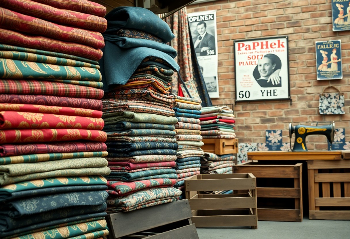
Tracing origins, you see Victorian wallpaper mills and William Morris's Arts and Crafts textiles (late 1800s) establish repeat, scale, and botanical density as foundational techniques. Liberty of London (est. 1875) mass-market florals for clothing, while Art Deco and postwar studios introduced geometric repeats; these production and stylistic milestones gave you the technical toolkit for confident pattern mixing.
The Shift from Minimalism
When minimalism dominated late-20th-century design—exemplified by white-box interiors and Apple’s pared-back products—you likely valued negative space and restraint. The swing began in the 2010s as social platforms amplified eclectic looks, and designers like Alessandro Michele at Gucci (2015) reintroduced layered ornament; you now see intentional excess used to convey personality and resist uniform branding.
Brands and ateliers translated that shift into measurable collections: Dries Van Noten and Gucci layered disparate prints across runway looks, while home labels such as Jonathan Adler expanded colorful ceramics and patterned wallpapers for mass audiences. You can experiment with digital mockups or mood boards, but beware—high-contrast, overlapping repeats increase visual fatigue and reduce clarity, so balance scale, color, and focal points when applying maximal patterns.
The Aesthetics of the Print Clash Era
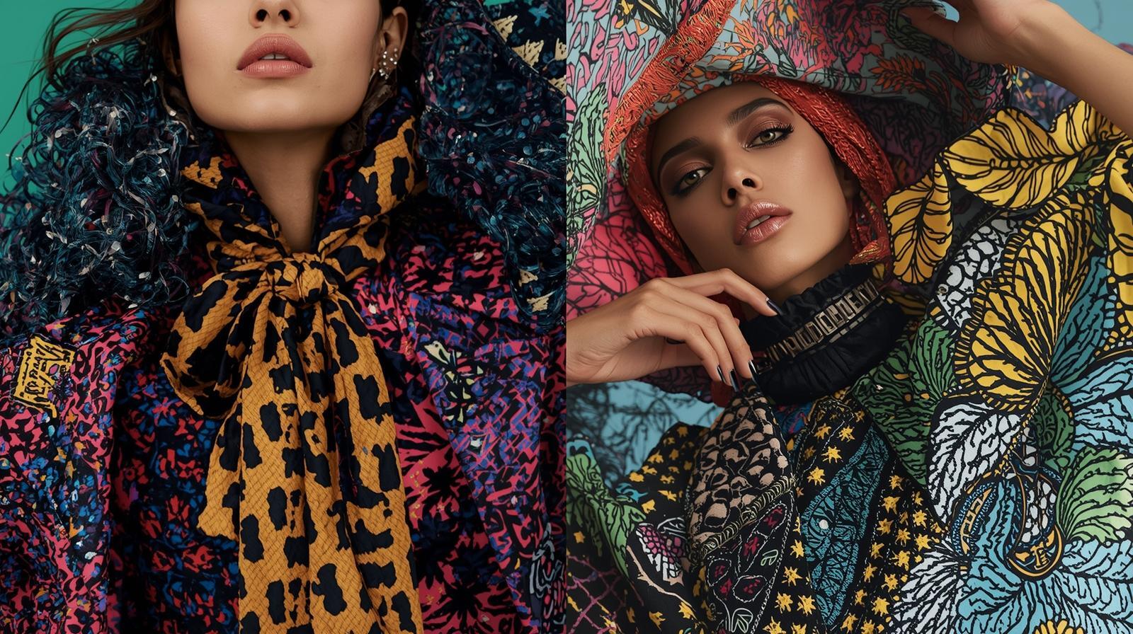
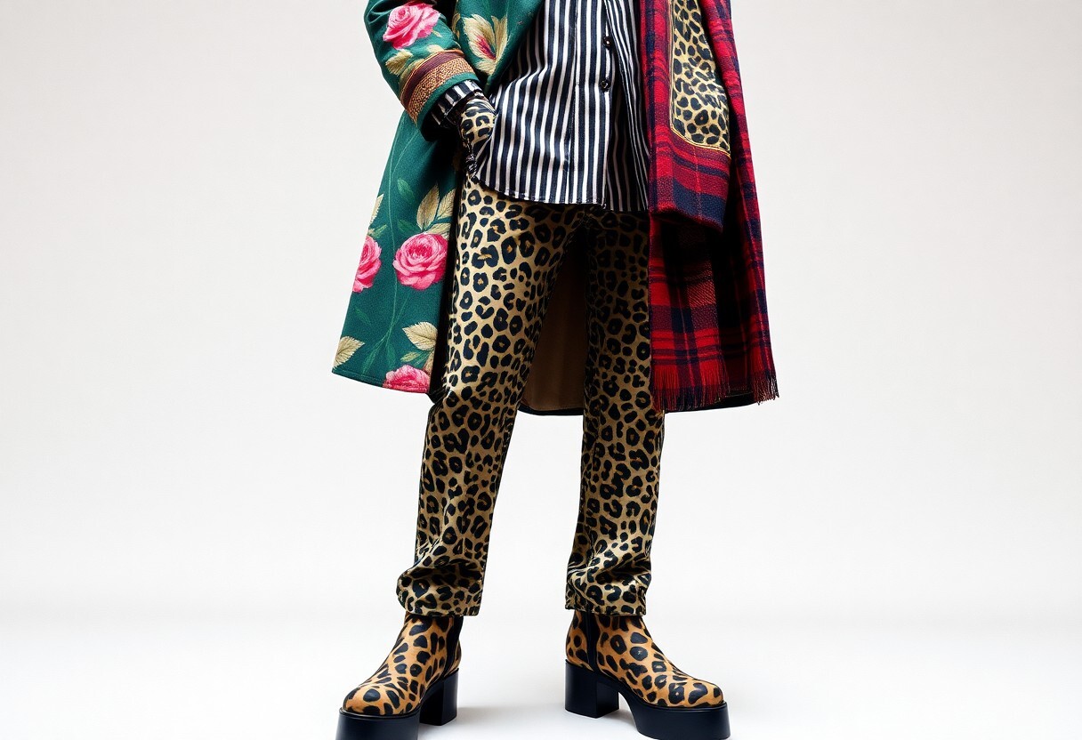
Alessandro Michele's Gucci runs from 2015 to 2019 show how 1970s florals, paisley and tiger stripes can coexist; you replicate that intensity by combining one dominant motif with several smaller repeats. Successful clashes often use 3-5 prints, vary the scale by roughly 3:1 between the largest and smallest, and mix textures like satin with wool to prevent visual flattening. If you ignore silhouette balance, the result easily becomes chaotic; when you get it right, the look delivers instant, high-impact identity.
Key Design Elements
You prioritize three mechanics: scale hierarchy (large vs. small), a clear focal anchor, and textile contrast. Try one anchor print plus 2-4 supporting patterns, use scale ratios around 3:1, and pair busy prints on lightweight fabrics with solid heavyweight pieces to preserve shape. Designers such as Dries Van Noten and Kenzo illustrate how repeating a single motif at different scales across garments creates coherence while keeping the visual energy high.
Color Theory and Pattern Mixing
You apply the 60/30/10 rule to prints: pick a dominant color family for ~60% of the look, a secondary for ~30%, and an accent at ~10% to pop. Complementary pairs (blue/orange) and analogous trios (green/teal/blue) are reliable; using a shared neutral or common hue across patterns instantly ties disparate motifs together. Strong contrasts increase visual tension, while muted value matches soothe it.
You can use value contrast as a practical cheat: match at least one tonal value (light, mid, or dark) across patterns so the eye reads continuity. For example, if you choose a red floral, introduce red in a stripe at 5-15% of the surface area to link prints, or deploy a black background in one pattern to ground brighter motifs. Brands like Missoni and Dries Van Noten frequently rely on this linking strategy to mix 4-6 colors without visual collapse; incorporate one neutral to give your composition breathing room.
Cultural Influences on Print Clash Design
You can trace print clash to movements like Bauhaus (1919-1933), Pop Art (1950s-60s) and Japanese ukiyo-e exchanges, with designers such as Kenzo (founded 1970) and Dries Van Noten channeling those vocabularies; you’ll also contend with cultural appropriation risks while leveraging creative hybridity that fuels the era’s bold mixes.
Global Artistic Movements
When you study pattern lineage, notice how ukiyo-e (Hokusai, c. 1831) shaped Western motifs, Bauhaus geometry informed minimal-to-maximal juxtapositions, and Pop Art (Warhol, 1960s) normalized consumer imagery; the Memphis Group (founded 1981) then reintroduced playful color blocks that you now see clashing on runways and streetwear alike.
The Role of Fashion and Pop Culture
You observe fashion houses and pop culture accelerating prints: Gucci under Alessandro Michele (since 2015) revived vintage clashes, Kenzo popularized bold botanicals, and streetwear moments like Supreme x Louis Vuitton (2017) turned mash-ups into commerce; beware how fast fashion can replicate trends rapidly, diluting originality even as you profit from visibility.
You should track platforms and moments that make clashes viral: Instagram’s visual feeds and TikTok’s post-2018 surge let a single runway look or K-pop outfit (note “Gangnam Style,” 2012, as an early global shockwave) spawn thousands of reinterpretations within days, creating both mass demand and accelerated copying across markets.
The Dynamics of Rule-Breaking in Design
Embracing Chaos and Imperfection
You can weaponize chaos and imperfection to give prints a lived-in texture: let 1-2 mm misregistration remain visible, embrace 3-5 screen layers that shift color, and allow irregular halftone dots to create depth. When you loosen tight grids and introduce deliberate flaws, the work reads as authentic and unpredictable, making contrast, scale, and materiality the primary drivers of visual tension.
Case Studies of Influential Designers
You should study designers who systematically broke rules: Rei Kawakubo (deconstructed shows from 1981), Maija Isola with the 'Unikko' (1964) motif that sustained decades of rework, Maison Margiela (founded 1988) for anonymity and repetition, and Off-White / Virgil Abloh (founded 2012, Nike collaboration 2017) for mash-ups of street and high fashion.
- Maija Isola / 'Unikko' (1964)—created in 1964; the design remains in rotation for 60+ years and is reissued at varying scales for apparel and home textiles.
- Rei Kawakubo (Comme des Garçons)—first Paris collection in 1981; deployed deconstruction across multiple seasons, reframing silhouette and surface without following conventions.
- Maison Margiela—label established 1988; used anonymity and repetition to challenge branding norms across runway and archive reuse.
- Off-White / Virgil Abloh—founded 2012; high-profile collaborations (notably 2017 with Nike) mixed street graphics with classical motifs at scale.
- Marimekko / Maija Isola - sustained bold pattern strategy with repeat-driven pieces that scale from 10 cm motifs to full-width textiles for interiors.
By dissecting these examples, you can extract actionable tactics: apply selective deconstruction, scale archival motifs 2-3× across layers, and balance 1 dominant print with 2 supporting patterns. When you prototype, test 3 scale variations and track visual hierarchy across distance to ensure impact without visual fatigue.
- Maija Isola—'Unikko': introduced 1964; pattern longevity > 60 years; common scale range 10-120 cm repeats for different products.
- Rei Kawakubo: Paris debut 1981; design approach spans > 40 years of iterative rule-breaking across collections.
- Maison Margiela: founded 1988; reuse and anonymity techniques applied across runway and product lines for 30+ years.
- Off-White / Virgil Abloh: founded 2012; major collaborations (e.g., Nike 2017) amplified print mash-ups and logo deconstruction.
- Marimekko: commercialized bold repeats with repeat sizes from 10 cm motifs to full-width 150 cm textiles, demonstrating scalable print systems.
Materiality and Techniques in Print Clash Design
You prioritize surface dialogue: mix a 120-220 GSM cotton tee with an 8-12 momme silk scarf or a 10-14 oz denim panel to create tension between drape and structure. Using heavyweight neoprene for silhouettes pushes printed motifs into sculptural relief, while enzyme-washed cotton softens contrast. For maximal patterns, you match substrate absorbency to ink chemistry, ensuring colorfastness and layer stability when you stack halftones, metallics, and flocking.
Fabrics and Textures
You choose fabrics by how they take ink and how they age: mercerized cotton increases dye affinity and sheen, sateen silk preserves fine halftones, and mesh or perforated neoprene adds breathability and depth. Practical benchmarks guide you: t-shirt knit at 120-220 GSM for screen detail, poplin or twill at higher counts for crisp repeats, and denim or canvas for abrasion-resistant prints that retain texture under heavy wear.
Printing Methods and Innovations
You deploy methods to match design intent: traditional screen printing for opacity and cost-efficiency, DTG for photorealistic gradients, and sublimation for edge-to-edge polyester transfers. Screen runs can reach ~500 prints/hour on industrial lines, whereas DTG yields 30-60 garments/day per machine for complex artworks. Be aware: discharge processes can weaken fibers and emit reducing agents, so you weigh finish versus hazard.
You also calibrate ink and cure parameters precisely: plastisol typically cures at ≈160°C (320°F) for 60-90 seconds, while dye-sublimation needs higher heat—about 190-200°C for 30-60 seconds—to fully gasify dyes into polyester. Pretreatments for DTG alter hand and washability, and UV or low-heat pigment systems let you print on mixed-media assemblies. When you pilot a technique, run wash tests (5-10 cycles) and lab colorfastness checks before full production.
Impact on Contemporary Design
You now encounter maximal patterns reshaping brand language: Gucci's Alessandro Michele era (2015-2022) and Versace's ongoing ornamentation show how layered motifs drive cultural relevance. Designers routinely combine 3-5 contrasting patterns with mixed scales to increase visual richness, and platforms reward that—Instagram searches and tag engagement for maximalism surged in the late 2010s. You should expect visual identity to trade minimal legibility for memorability when maximalism is wielded intentionally.
Adoption in Various Industries
Across fashion, interiors, and digital media you see adoption: fashion houses like Gucci, Versace and Balenciaga use dense prints on runways; hospitality groups apply eclectic textiles in boutique hotels; and packaging projects mimic collage-driven maximalism for limited drops. Spotify's annual Wrapped campaigns leverage exuberant graphics to reach hundreds of millions of listeners, proving how maximal visuals boost shareability. You must adapt the scale and material per industry to avoid functional failures.
Future Trends in Maximalism
Expect AI-driven pattern generation and AR try-on to dominate: AI-generated prints (GANs, Adobe Firefly since 2023) will let you produce thousands of unique motifs, while AR commerce lets customers preview layered patterns in situ. Brands will favor modular systems that produce 10-50 coordinated variants per launch, shifting design from static collections to dynamic, data-informed assortments.
Deeper on that, you should plan workflows integrating parametric tools (Houdini, generative libraries) to automate repeatable pattern families and reduce manual mockups. Case studies show on-demand printing and digital proofs cut time-to-market; for example, brands using print-on-demand report faster SKU turnover, so you can scale personalization without massive inventory. Balance computational variety with production constraints to keep projects profitable.
Conclusion
The Print Clash Era—with maximal patterns and zero rules—empowers you to push your aesthetic boundaries: you can layer bold prints, mix unexpected scales, and prioritize visual impact over convention, developing a distinct voice that challenges norms while mastering balance, contrast, and intentional chaos in service of striking, confident design.